
My Railroad Herald
- Thread starter Sir_Prize
- Start date
You are using an out of date browser. It may not display this or other websites correctly.
You should upgrade or use an alternative browser.
You should upgrade or use an alternative browser.
Chessie6459
Gauge Oldtimer
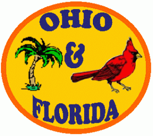
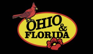
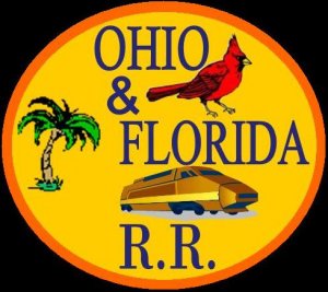
About adding some R.R. tracks going from the tree to the bird, with the bird's feet perched on one of the rails, thereby tieing the two states together?
How about including "RR" or Rwy" in back of "Ohio & Florida"... or like Tyson suggested "some tracks" ??? Otherwise, it's a good lookin' design, Ken.
Bob :thumb:
Bob :thumb:
You could always throw in a "PINK FLAMINGO" for Florida. Just kidding. The track idea sounds good.
Dwight77 (in Florida where we are having a cold wave today --- high of only 68* and tonight a low with wind chill factor of about 38* --- but there isn't any of that funny white stuff on the ground)
Dwight77 (in Florida where we are having a cold wave today --- high of only 68* and tonight a low with wind chill factor of about 38* --- but there isn't any of that funny white stuff on the ground)
Ken, what era are you modelling?
I hate to be a picky graphic designer here, but the avatar version with the groovy blend in the background is very modern, even computer-looking. Logo's and heralds which have to be painted repeatedly don't use graduated tones, as they are just too expensive to reproduce. Likewise, the bird and palm logo uses 7 colours (orange, red, yellow, blue, green, brown, black) making it also very expensive to mass produce.
I like the concept though. I took a crack at it - hope you don't mind. I picked the 3 essential colours, red, yellow and black. Instead of a palm tree I used a hibiscus flower to keep the colours to 3. These designs would be for a pre 1960s road. Later would be more streamlined and designerly - like CNR, CSX etc.
Val
Attachments
kf4jqd
Active Member
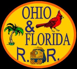
I have to agree with Val here, I like the second version though. But, i'd say replace the hibiscus flower on the second one with thepalm tree again, make the trunk the same yellow (preferably a duller yellow) as the center and put the green leaves back in. the palmtree can be trimmed in a light red line to sperate it from the other yellow and this will put it on par with pre-1960 designs as well. some did go the 4 color route, but 4 is pushing it.
Val, you ever thought of going into the custom herald design busniess, you could make a fortune")
Val, you ever thought of going into the custom herald design busniess, you could make a fortune
Val-
Wow! Those are VERY, nice Val!
The avatar is the Public "showy" emblem, then the shirt patch (I posted) will be more elaborate than whats on the Engines. (see the ALL statement below)
Hmmm... Perhap I should not have called that my Herald...
Andy-
It's fictional.
Tyson, Bob-
Doh! See... I forgot something. Thanks for the point out.
ALL-
My era I the present, with a twist...
Here's the deal:
My lines primary business is Themed Passenger Service (Super Bowl Train, Fall Leaves Train/Excursion, Mardi Gra Train, Snowbird Special, etc.) throughtout the United States.
The daily business is running/subsidizing local switching, some "Mainline" delivery, some over-the-road service (trucking), and many locations of Public transporttion being subsidized.
Color:
The engines will most likely just have the name (opposing color to what is painted below ie.-Blue letters over Orange)and the three colors: B&O Enchantment Bue, FEC Orange (what was on the Life-Like E's), and a "golden" yellow (somewhere between B&O's, C&O's, and FEC's). The passenger related Power will have white as the major color, with the other colors as striping or "graphics." The Switchers and Road Units will have the 3 colors (several different versions, each given a year that it was painted- adding history).
That should explain it... I think...
Well... Gotta get some shelves built. Won't have anyplace to put my Railroad stuff till I do.
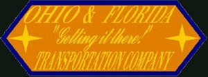
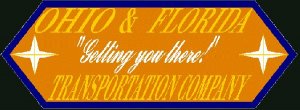
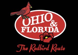
Ken, as I tell my graphic design students (over and over, hehe) you have to establish "heirarchies" of information. Simply put, this means you decide what is the most important information, secondary, tertiary etc. Then use larger, bolder type for most important info, smaller, lighter type for secondary info, etc. Colour contrast is also an important factor. There is more contrast between white and orange for example, than there is between yellow and orange. Condensing type is considered a last resort. Never condense type more than 85%, as it begins to distort. Serif type can be condensed a little more than sans serif.
So, here's the critique from the "teacher". The lozenge heralds have been nicely simplified, which works well and has a more modern look. But, the type is too condensed and too close to the edge. "Ohio & Florida" is the most important information and should be in white. The tagline would be in yellow. "Transportation Company" also has a more modern ring to it, as many modern railroads offer trucking, logistics and even ships. CPR went to CP Systems. If you're looking for a shorter word (which never hurts) you might consider that.
Also, most modern railroads are well known, which means they don't spell out the whole name in the logo. Examples are UP, CSX, CN. Maybe you could play around with that idea.
Ok, class dismissed.
Val
spitfire said:Ken, as I tell my graphic design students (over and over, hehe) you have to establish "heirarchies" of information. Simply put, this means you decide what is the most important information, secondary, tertiary etc. Then use larger, bolder type for most important info, smaller, lighter type for secondary info, etc. Colour contrast is also an important factor. There is more contrast between white and orange for example, than there is between yellow and orange. Condensing type is considered a last resort. Never condense type more than 85%, as it begins to distort. Serif type can be condensed a little more than sans serif.
So, here's the critique from the "teacher". The lozenge heralds have been nicely simplified, which works well and has a more modern look. But, the type is too condensed and too close to the edge. "Ohio & Florida" is the most important information and should be in white. The tagline would be in yellow. "Transportation Company" also has a more modern ring to it, as many modern railroads offer trucking, logistics and even ships. CPR went to CP Systems. If you're looking for a shorter word (which never hurts) you might consider that.
Also, most modern railroads are well known, which means they don't spell out the whole name in the logo. Examples are UP, CSX, CN. Maybe you could play around with that idea.
Ok, class dismissed.
Val
Will this be on the test?