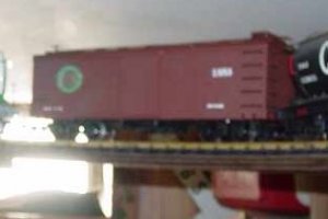
Here's two versions of the herald for my free-lanced Elora Gorge & Eastern. The black background behind the large herald was used mainly on reefers, although there were many boxcars that also had it. Wooden boxcars generally got the smaller version, as seen at left, with no black background. Most early 40' and 50' steel boxcars got the smaller herald, again with no black background, and also received the "Way of the Warriors" slogan. The slogan appeared only on steel boxcars and reefers.
Early flatcars and gondolas had no heralds, while later gondolas got the same size as the ones used on early boxcars, and an even smaller version was developed for flatcars. Subsidiary Grand Valley, whose freight car roster is mainly two-bay hoppers, has a handful of cars with a similar herald, with the difference being the wording around the Indian head. It reads Grand Valley Central. The slogan is not used.
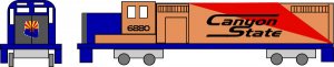
In the 1920's, when the herald was first designed, it was not used on locomotives, but this began to change in the early '30's.
Most diesels in later years also used the herald, in some form.
There are probably over two hundred freight cars and quite a few locos wearing the herald. The first 50 sheets that I ordered from C-D-S consisted only of the slogans, in both black and white, along with large and small heralds in white, and large black circles for the backgrounds. Reporting marks were done with Letraset dry transfers. As Letraset became more expensive and harder to find, I ordered a second batch of custom lettering from C-D-S. This included the reporting marks and numerals, along with various size heralds, all in white. A third order consisted of smaller lettering for gondolas, flatcars, and older boxcars, along with varied dimensional data and reweigh/repack info. Also included was some special lading notations, including the lettering on the doors of these early covered hoppers.
The stencilling reads: FLUX LADING ONLY. WHEN EMPTY, RETURN TO GERN INDUSTRIES LTD. AT PORT MAITLAND, ONT.
The original design for the logo was a drawing that I did of a Plains Indian, with a full headdress, but because my railroad was situated in Southern Ontario, it seemed hardly appropriate. Instead, I did a "rubbing" of the Indian head on the American nickel, then flipped it as a mirror image. I added the circling band with the roadname, then redrew it in drawing ink. I took it, along with the drawn slogans, to my brother Steven, who photographed it, then made a positive for the guys at C-D-S to use as the master for making my dry transfers.
The slogan originally referred to the Grand River, along whose banks the EG&E supposedly runs, as the "Way", and the native Americans, many of whom made their home in the area after the American Revolution, as the "Warriors". It didn't take the locals long to dub the frequent fast freights roaring along the banks of the Grand as "Warriors", though, and the name stuck.
I hope you've enjoyed this brief history of the EG&E's lettering schemes.
Wayne