Constellation class available on Zoushos site

Status
Not open for further replies.

D-WHALE

Utopia Planitia Engineer
Aug 25, 2007
485
405
58
48
Schwedt/Oder, Germany
Pic13:
go to the "smart fill tool" and change the options for the fill and the outline like the picture show! the new object is visible in the object manager

pic14:
make the same with all letters and numbers

pic15:
go to the object manager and select ALL the new objects, click the right mouse button and "combine" all the ojects together

pic16:
move now the new object under the normal font

pic17, 18 and 19:
repeat step 13 to 15, but change the outline options in the "smart fill tool"!
you can see the result
 

Attachments

  • draw13.jpg
    draw13.jpg
    160.1 KB · Views: 11
  • draw14.jpg
    draw14.jpg
    162.6 KB · Views: 7
  • draw15.jpg
    draw15.jpg
    168.7 KB · Views: 5
  • draw16.jpg
    draw16.jpg
    150.7 KB · Views: 7
  • draw17.jpg
    draw17.jpg
    150.7 KB · Views: 8
  • draw18.jpg
    draw18.jpg
    142 KB · Views: 6

D-WHALE

Utopia Planitia Engineer
Aug 25, 2007
485
405
58
48
Schwedt/Oder, Germany
pic19:
here is the complete result! now you can make the circle unvisible (sorry, i forgot the pic:eek:ops:)

than print it out, save the file or convert the CDR-file to a JPG format with Corel PhotoPaint! OR change it to a SVG-file and use "INKSCAPE" to convert the file to a PDF!!!

that is the hole secret:mrgreen:

Greetings
Marko
 

Attachments

  • draw19.jpg
    draw19.jpg
    160.8 KB · Views: 8
C

cmags

That's a sweet procedure you got there. I'm going to have to find a way to do something similar in PaintShop Pro! Now to find that font that already has the outline... I've got one similar but w/o the outline, so I was making my own.
 

c_furuti

New Member
Feb 25, 2009
35
0
6
Lettering with Inkscape: how-to

Hello,
:inmew:
In a previous post, D-WHALE mentioned using Inkscape http://www.inkscape.org, a free vector tool, for converting to PDF. I actually use it for the whole lettering process. Here's a sketch of the steps (I use Inkscape 0.46 for Linux, but there are versions for other operating systems; please note that hotkeys can be reconfigured and change between versions) applied to Zousho's Constellation model.

Create a new Inkscape document, File>Import... constellation-B.jpg.

snap1_50.jpg

The original file has a 203 dpi resolution and Inkscape currently assumes bitmaps are 90 dpi, so I losslessly scale the image to 90/203 = 0.44335. With the image selected (F1), click the padlock icon in the toolbar, change the unit drop-down box on the right to "%", type "44.335" in the "W" field, then type Enter. Position the image in the center of the page.

snap2_50.jpg

Now do Effects>Images>Embed All Images, Apply. The file's size will increase, but now it can be moved/stored independently of the original jpg.
Open the layer panel: Layer>Layers.... Layers are not strictly necessary, but they help avoiding selection mistakes. Leave the image in the default "Layer 1", padlock this layer, then create a new layer above (Layer>Add Layer...) named "Text", and leave it selected.

snap3_50.jpg

Drag two guidelines approximately centered on the top saucer part, choose the Ellipse tool (F5).Click on the guides's intersection and drag to an approximate size keeping Ctrl+Shift pressed (this will keep the ellipse circular and centered). Object>Fill and Stroke... opens a dialog to adjust the curve's color and thickness. Click the "X" button on the Fill tab to make the ellipse hollow.

snap4_50.jpg

Choose the Text tool (F8) and type the registry number. Use Text>Text and Font... dialog to set the font - I got Starfleet Bold Extended at http://downloads.outpost10f.com/font.html - and approximate size.

snap5_66.jpg

Select both ellipse and text, then Text>Put on Path. By default the text will go on the outside of the curve. To fix this, select the ellipse, Path>Object to Path, Path>Reverse.

snap6_66.jpg

To be continued...
 

c_furuti

New Member
Feb 25, 2009
35
0
6
Lettering with Inkscape: how-to part 2

Click twice on the ellipse, changing its handle to rotation arrows. Drag one of the arrows till the text is approximately centered.

snap7_66.jpg

Fine-tune the size of the text and radius of the ellipse (the latter is easier if you type in the "W" field beside the padlock, since it keeps the curve centered). Large text inside a curve is usually too tight, so insert some manual kerning between the characters (position the cursor, then Alt-arrows). You may rotate the ellipse again to recenter the text.. When satisfied, make the ellipse invisible by selecting it, Object>Fill and Stroke... and clicking the "X" button in both Fill and Stroke paint tabs.

snap8_66.jpg

Now select the text, Path>Object to Path, Path>Break Apart. This step is necessary because we must color the red outlines. From now on, the characters are only curves and cannot be changed any more as text - therefore if you want to build a fleet of Constellations, add the name (see ahead) and save before this step!.

snap9_50.jpg

Select all character paths, Object>Fill and Stroke, click on the "X" on the Fill tab, select the plain color square at the Stroke paint tab, then choose a thin width at the Stroke width tab - this will make easier selecting individual paths.

snap10_50.jpg

The ex-character "N" has three paths which we'll call A, B and C, from inner to outermost. First we must create a new path which is the difference of B and C (i.e., a hollow, futurely red, outline). Inkscape can create path differences, but the inner one must always be "above" the outer one. So select B, raise it (use the toolbar buttons, or Object>Raise to Top), select C, lower it, select both, then Path>Difference.
Now Object>Fill and Stroke, choose a red fill and no ("X") stroke:

snap11_67.jpg

Repeat on all other characters. "Holes" in "4"s and "9"s are handled in the same way.

snap12_50.jpg

To be continued...
 

c_furuti

New Member
Feb 25, 2009
35
0
6
Lettering with Inkscape: how-to part 3

[Interesting, part 1 of this series was postponed waiting for moderation, but part 2 was apparently accepted immediately. This means it may be out of order :-( ]

Insert the ship's name in the same way. I used the Federation font from the same source, and since it has no outlines, there's no need to convert it to paths now.

snap13_50.jpg

Finally let's simulate a subtle headlight highlight. Create a new layer "Highlight". Select all objects in the "Text" layer, Edit>Copy, select the "Highlight" layer, Edit>Paste in Place. Temporarily hide layers by clicking on the eye icon to make sure the copy is there.
We want a semitransparent, blurred shape partially covering the text, but not the texture underneath:

  • convert the ship name's copy to a path
  • select this path and the registry number's copy, Path>Union
  • create a filled ellipse roughly matching the white highlight in the texture
  • select both united path and the ellipse, Path>Intersection
Now fill this shape with a linear gradient, opaque white on the left and transparent white on the right, blur it slightly, and unhide the "Text" layer:

snap14_67.jpg

Repeat on the bottom saucer, then File>Export Bitmap. Select Drawing. Optionally convert to JPG, or print to PDF.

I didn't build the Connie yet, but this is Zousho's Thunderchild which I lettered and built at 70% scale (since I printed at only 300 dpi in plain paper, caring about the hollow red outlines was probably overkill). IMHO the ship looks boring without the name, so I included it even though it appears anonymous on-screen.

IMG_3779_20.jpg
 

c_furuti

New Member
Feb 25, 2009
35
0
6
Lettering with Inkscape: addendum to how-to part 2

[Still waiting for first part to be released]

In part 2, I obviously :eek:ops: forgot to mention that, after applying the red outline, the innermost path A should be filled with black, and the stroke removed.
 

c_furuti

New Member
Feb 25, 2009
35
0
6
Lettering with Inkscape: how-to part 1, redone

[After waiting for 10 days, and after a private message to an administrator and a post to the help forum (both so far unanswered), I decided to rewrite as best as possible and post again the first part of my very first post. As previously mentioned, that part was held for moderation, but the 2nd and 3rd ones were published immediately]

:inmew:

In a previous post, D-WHALE explained his method for lettering Zousho's U.S.S. Constellation model, and suggested inkscape (www.inkscape.org), a free vector application similar to Corel DRAW!, Xara and Illustrator, could be used to convert the result to PDF. I actually use Inkscape for the entire process, which roughly goes like this:

[note: I use Inkscape for Linux, but it is available for other operating systems; the hotkeys I mention could differ for your system]

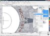
First open Inkscape, then 
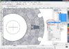
File>Import the bitmap constellation-B.jpg

snap1_50.jpg

The original file's resolution is 203dpi, and Inkscape assumes imported bitmaps have 90dpi, so the image object must be scaled down by 90/203 = 0.44335. Select (F1) the image, click the padlock icon in the toolbar, change the unit drop-down box on its right to "%", then type "44.335" in the "W" field on its left, and type Enter. This will change both W(idth) and H(eight) to the appropriate size. Either manually position or use the alignment tools to center the image on the page.
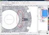
snap2_50.jpg

By default Inkscape links to bitmaps. Do Effects>Images>Embed All Images, Apply; it will greatly increase the Inkscape file size, but now your work can be moved and copied anywhere no matter where the original bitmap is.

In order to avoid accidental selection, it's easier doing everything in separate layers. Open the layer panel Layer>Layers... Leave the bitmap in the default "Layer 1" and lock it with the padlock icon; create a new layer above it (Layer>Add Layer...) named "Text" and leave it selected.

snap3_50.jpg

Drag two guides approximately to the center of the top saucer part, then select (F5) the Ellipse tool. Click on the intersection of the guides, and drag an circle of approximate size, keeping both Ctrl and Shift pressed, to keep the curve circular and centered. Object>Fill and Stroke... opens a dialog to adjust the curve's color and thickness; on the Fill tab, click the "X" button to make it hollow; on the Stroke tab, give it a contrasting color, we'll make it invisible later. You may also do that using the bottom toolbar.

snap4_50.jpg

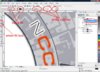
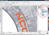
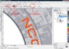
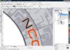
With the Text tool (F8) type the registry number. Open the Text>Text and Font... dialog to choose the font and size. I got "Starfleet Bold Extended" at Outpost 10F, http://downloads.outpost10f.com/font.html. This font has proper outlines, but all in one color and as superimposed nested paths. We'll make the outlines red later.

snap5_66.jpg

Select (F1) both ellipse and text, Text>Put on Path. By default the text goes on the outside. To fix that, select the ellipse, Path>Object to Path, Path>Reverse.

snap6_66.jpg

[continued in the previously posted part 2]
 

Paragon

Active Member
Apr 22, 2007
814
48
38
37
Greenville NC, USA
www.freewebs.com
I've started using fonts from this website now:

http://www.talshiar.org/Fonts/

In photoshop, I enter the text in red at a much larger size than the model, bend it, then rasterize and color the letters inside black, and then shrink it down to fit the model. Its necessary to rasterize the text at a high resolution, or the paint bucket tool will bleed over into the part of the letters you don't want to color.

This method works very well when you have an extra file open in Photoshop at a very very high resolution, say, 500 pixels per inch. Copy the part that needs the text from the other window to the high res one, and blow it up. Then when you use the text tool you can wrap it directly on top of the piece, yet still rasterize it at high res to prevent bleed from the paint bucket.
 

c_furuti

New Member
Feb 25, 2009
35
0
6
Paragon,

In order to create the red border, do you use an outlined font or do you render the text twice (red then black)?
 

c_furuti

New Member
Feb 25, 2009
35
0
6
Text orientation on the underside of saucer

An unrelated question: I've seen some TV shots showing the U.S.S. Valkyrie, one of the Connie's sister ships, and in Mike Trice's site

http://www.mjtsc.pwp.blueyonder.co.uk/starg.htm

a few photos of its studio model from a Paramount exhibition. On the underside, they all show the texts oriented with the top towards the saucer's center, just as in the upper side. Is it only me who thinks this orientation ugly and hard to read?

Notes:

  1. Zousho's own built model follows the TV orientation
  2. D-WHALE, like me, preferred the top towards the rim
  3. IIRC, other Federation classes with text oriented along rings also have tops towards the rim
  4. the Paramount exhibitors seem rather careless. The Valkyrie was set upside-down, and the text is clearly a bad overpaint job
 
Status
Not open for further replies.